Crest Artwork for Knitwear: What the Stitch Can Hold, and What It Loses
更新 2026/9/19约 12 分钟阅读作者:Simon Liu · Licheng Knitwear
A practical guide to preparing a crest, badge or logo for a knitted garment: which file formats work, why fine text and thin outlines fail where they survive on a printed tee, and how gauge changes the amount of detail a garment can carry. Written for the buyer whose artwork already exists and cannot be redesigned.
Almost every crest we are sent was drawn for something else. A school badge designed for a letterhead, a club emblem that has lived on a printed t-shirt for a decade, a company mark from a brand manual written for signage. All of them are correct artwork. Not all of them survive being knitted or embroidered at chest size, and the ones that do not fail in predictable ways.
This is a guide to knowing which you have before you commit to a garment, not after.
The stitch is the resolution limit
A printed graphic can be as fine as the ink allows. A knitted or embroidered one cannot: the smallest mark it can make is one stitch, and everything in the artwork has to be expressible in whole stitches. That single fact explains almost every problem we flag on incoming artwork.
Three things fail most often.
Fine text. A motto, a founding date, a chapter name set in a small serif face. On paper it is legible at 8pt. Embroidered at chest size it becomes a textured band that reads as decoration rather than as words. The practical floor is that a letter needs enough height for its strokes and its counters - the enclosed spaces in letters like a, e and o - to each be more than one stitch wide. Below that the counters fill in and the word turns into a shape.
Thin outlines. A crest whose shield is defined by a hairline keyline often loses the line entirely, because a line thinner than one stitch either disappears or is rounded up to a stitch and becomes heavier than the rest of the design. Outlines that carry meaning need to be drawn as shapes with width, not as strokes.
Gradients. A shield that fades from one colour to another is a print idea. Knitting and embroidery build colour from discrete threads, so a gradient is reproduced as bands. Sometimes that reads beautifully and is worth keeping deliberately; more often it looks like a mistake. Either way it is a decision to make at artwork stage, not a surprise at sampling.
Gauge changes how much detail fits
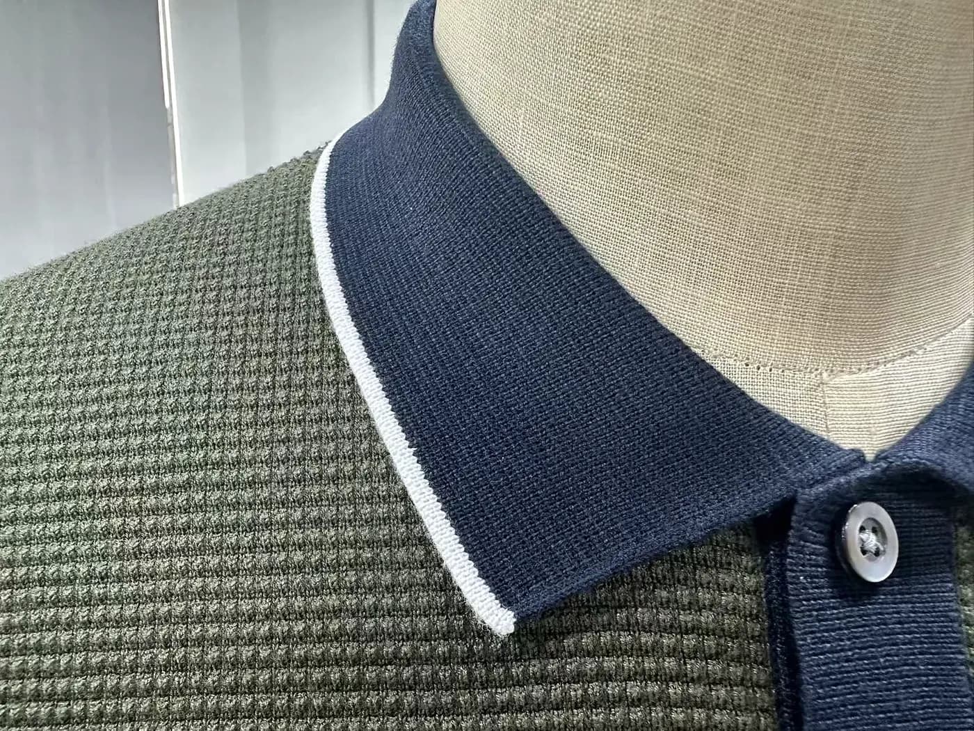
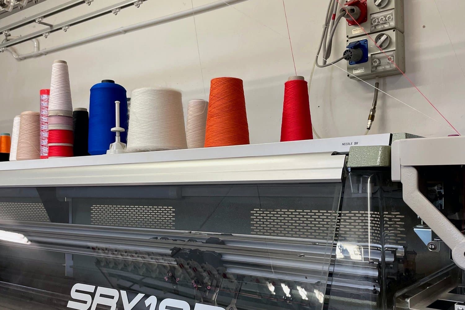
The knitted body's gauge sets how fine the fabric is, and it interacts with the crest. Our in-house range runs 3GG to 18GG. At 3GG-5GG - a chunky, outerwear-weight body - the fabric itself is coarse and a crest with fine internal detail will fight it; simpler, bolder marks look better and wear better. At 7GG-12GG, where the majority of sweaters, cardigans and knit polos sit, a normally detailed crest reproduces without argument. At 12GG and finer the fabric holds more detail than most crests need.
This matters when a group has already chosen the garment. If the committee has settled on a heavy cable-knit vest and the crest is a fine-line coat of arms, one of the two has to give - and it is far cheaper to know that before sampling.
What to send
Best case, vector artwork: AI, EPS, or a PDF with live paths. Vector can be scaled to the exact application size without losing definition, and it lets us see the construction of the mark rather than guessing at it.
Workable, and what most first enquiries actually arrive with: a clean, high-resolution image. A crest lifted from a website at 400 pixels wide is usually enough to quote from and often enough to work from, though it may need redrawing before production.
Also useful, and often overlooked: a physical example. If the group already has the crest on a blazer, a cap or an older garment, a photograph of that tells us more about intended size and placement than a file does.
What we do with it: we will tell you before sampling if something will not hold at the size you want, and where a small redraw would fix it. Redrawing a crest slightly - thickening a keyline, simplifying an internal element, resetting a motto in a face with more open counters - is a normal part of putting a mark onto knitwear. It is not a redesign, and it is not us taking liberties with your identity. What we will not do is sample something we already expect to read as a blur and let you discover it when the sample lands.
Placement and size
Chest left is the default and the safest. It sits where a crest is expected, it is the flattest area on most bodies, and it is the least affected by the wearer's movement. Larger centre-chest applications work but need the garment's construction checked first - a crest that crosses a button placket, a zip line or a cable panel has to be planned around the structure rather than dropped onto it.
For a sleeveless vest the front panel above the waist rib is usually uninterrupted, which is one practical reason that body keeps coming up in group orders.
What this costs you in time
Artwork that arrives ready costs nothing. Artwork that needs a redraw typically adds a few days before sampling starts, because the clock on our 15-25 day sampling window begins when the specification is confirmed - not when the first email arrives. On a programme with a fixed event date, artwork is the most common reason a week disappears early, and it is the easiest one to prevent.
Send the crest with the first enquiry rather than after the quote. It costs you nothing and it moves the only genuinely unpredictable part of the job to the front.
Vector artwork - AI, EPS or a PDF with live paths - is best, because it scales to the exact size without losing definition. A clean high-resolution image is workable and often enough to quote from, though it may need redrawing before production.
Because the smallest mark a stitch can make is one stitch. A letter needs its strokes and its counters - the spaces inside letters like a, e and o - to each be more than one stitch wide; below that the word fills in and becomes a shape.
Not as a smooth gradient. Knitting and embroidery build colour from discrete threads, so a gradient is reproduced as bands. That can be kept deliberately, but it is a decision to make at artwork stage, not a surprise at sampling.
Left chest is the default and safest position: it is where a crest is expected, the flattest area on most bodies and the least affected by movement. Larger centre-chest crests work, but must be planned around any placket, zip line or cable panel.
Only slightly, and we tell you before sampling: thickening a keyline, simplifying an internal element, or resetting a motto in a face with more open counters. That is a normal part of putting a mark on knitwear, not a redesign.
We focus on men's sweaters, cardigans, knit jackets, jacquard knitwear and private label knitwear. We support B2B buyers with OEM/ODM development, sampling and bulk production planning.
Ready to Start Your Project?
Get a free catalog or submit an RFQ today. Our team will respond within 24 hours.